
Background
In early 2020, as the COVID-19 pandemic was starting up and everything was shutting down, I found myself out of a job.
For many years, I’d worked at the Pike Place Market here in Seattle, selling paintings for Tim Robinson, a local artist who had been at the market for 40 years. It wasn’t a full time job, left me time to start my training in web design, but it was a nice, consistent gig. But with the market closed for the pandemic, and Tim thinking about retiring anyway, there was no way I could continue on.
About a month after that, though, Tim asked if I could use my new skills to build him a brand new website. The one he had at the time had been built by another friend many years before, and he had no idea how to update it on his own. It had a very outdated and somewhat unprofessional look for 2020, it didn’t even work at all on smartphones.
I agreed to help and got to work. The primary thing that Tim was selling were large-format giclee prints. Which is to say, they were very high quality and printed on canvas, then touched up by hand with acrylic paint, the same kind used on the original paintings. Many people walking up to the booth at the market assumed they were all originals.
My close familiarity with the material he was selling proved to be essential to the creation of an effective website.
Planning
The first step was to figure out what the website needed to accomplish. Who was the audience? What would they be looking for? What did similar websites look like?
In fall quarter 2019, and winter quarter 2020, I took classes on “web authoring”, and in both of them the final project was a website for a real business. So, I already had a solid plan for going through this process of research and implementation.
First, I went and did some research on other artist websites, to see what the general standard of design was. I took inspiration from three in particular:
- https://www.artofmikemignola.com/ : This website features a very stylish and basic layout, which places the art first and foremost. The navigation is easy to use.
- https://waynebarlowe.com/ : Features extensive descriptions and examples of artwork, as well as a more detailed biography.
- https://www.gregkucera.com/index.htm : A local gallery site, showing a very spare but professional-looking design.
This gave me a good starting point with a few aesthetic touchstones for the design of the new site: keep the focus on the art, not on the site itself, make it spare and professional. This isn’t a place to show off my skills, it was a place to use my skills to highlight the work of Tim Robinson as much as possible. No need for fancy menus or extraneous elements, just some basic menus and text boxes.
After that, I wrote up some profiles of user personas, as I’d learned to do in one of my classes. This was where my personal experience selling this art really came in handy, I didn’t have to imagine what the customers were like, I’d met hundreds of them over the years. I could tell what it was they were looking for: specific pieces they’d seen in person, and prices. Thus, I knew it would be critical to have a digital gallery with as much of Tim’s work as possible.
I knew that I couldn’t make the kind of gallery I wanted all on my own, so I did some research and found a thing called FancyBox that could be used commercially for a small fee. It was just perfect, having the features that I needed, a gallery that supported captions and zooming in. I could have gone and figured out how to recreate it on my own, but it was much faster to just use the version that already existed.
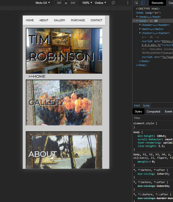
At this point, I started sketching out some different ideas for the site’s layout. I find it much easier to do this kind of work with a pen and paper, at least in this early stage. The site was going to be responsive anyway, so going in for exact measurements wasn’t necessary yet.

As I did this work, I shared it with Tim through a shared google doc, updating it as I went along. He really appreciated this, and sent me emails with suggestions, really making it more of a collaborative process. I was able to create a site that fit his needs and aesthetic sensibility due to this feedback.
At this point, I had my basic layouts and my list of pages I needed to make, and it was time to start working on implementing it!
Implementation
At this point, my knowledge of HTML and CSS was somewhat modest, but I was eager to try out some things I’d learned about in my classes. One thing in particular was CSS grid, a method for laying out a page where you assign different sections a grid-name and then lay them out visually within the CSS itself.
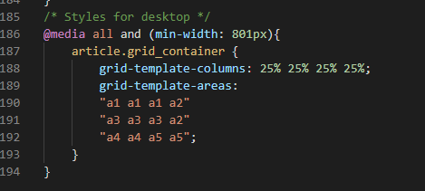
It was a bit tricky to get it working properly, there are some weird edge cases with how it handles margins and padding and whatnot, but I got it all figured out. Learning to do research and then experiment was a big part of the classes I had taken, so it was easy to apply the same principles to a new project.
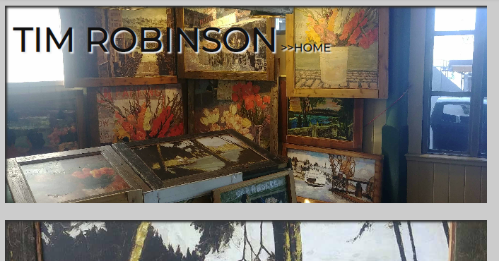
For the colors on the site, I decided to use only grayscale for the UI elements. I would include plenty of examples of the art on the page itself, but the menus and other page elements would be colorless.
Something I really wanted to get across was a sense of depth. Rather than merely existing as a flat website, as many artist sites do, I wanted to lean into the idea that these were paintings. A hallmark of Tim’s artwork is the texture of the paint, and how it gives them all a unique visual character. This is why he always touches up his prints with thick globs of acrylic paint, to replicate that effect from the originals.
To that end, I made use of box-shadow and text-shadow, to give every little “panel” on the home page the look of a scrapbook. It’s as if you were looking at this art underneath a frame, rather than on the same “plane” as the main page itself. This fits with the way that the CSS background-image property displays images by default, cutting them off around the edges and maintaining the original aspect ratio.
While developing this site, I made use of Visual Studio Code to do the coding. I really like using that particular IDE, though it isn’t the one my teachers used at the time. The auto-completion, linting, and general usability were much better than Brackets, the free software I was taught to use.
When things went wrong, I would use the Chrome inspector tools to try and figure out what was going on. It’s always nice to be able to peek at what CSS rules are being used or ignored on a given page element. I never would’ve puzzled out how to use grid properly without that! The ability to test the site on different phone sizes without opening it up on my phone was a big help too.
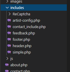
I made the site using all PHP files, though I had not yet taken a class in PHP. One of my teachers had given us the code to make header and footer includes, as well as how to implement a simple contact form. In the planning stages, I had concluded that there was no need for a complex web commerce implementation for this website, since individual sales would require communication back and forth between Tim and the customers anyway. So, all that was needed was that same secure contact form, styled to fit the look of the site, of course.
The process of implementing the PHP was very simple. I made sure the header and footer were working the way I wanted them to, and then I simply cut them out and put the HTML code in a separate file. That way, it was easy to make alterations to the header or footer and not have to propagate the changes across every single page by hand.
Throughout the site, I used those same scrapbook-style panels, made from photos of prints that I had personally taken over the years of working at the market. They had a kind of rougher look than the high-res scans that Tim sent me, but it felt appropriate to use actual photos of the prints as decoration for the site.
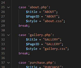

I made a unique grid layout for each page, to fit the content. This was easily done with separate CSS files for each page, loaded in on the basis of a switch statement in the PHP config file.
Since the site didn’t have a large number of pages, it only made sense to create some custom CSS for each one. Though I did end up being a little disorganized, and making stylistic changes on some pages that I then had to add back into the “main” CSS file. This really helped me understand how to better organize my CSS for future projects, I was glad to have the experience.
The process of getting the site up involved a lot of back and forth and trouble switching email addresses and hosting companies, but I was able to assist with that as well. I figured it would be a good experience to deal with these kinds of problems, and now I know what to look out for in the future.
Results
The resulting website was a resounding success. Tim was very happy with the look of it, and his online sales increased 200% after it was put up.
A few times, I’ve had to go back and fix a few typos or other minor mistakes, but otherwise I haven’t had to make any major changes since I finished it in May 2020. For these minor corrections, I was able to use the FTP credentials that Tim gave me to upload the files directly, which was nice. Since he’s someone I know and trust, I was able to expedite the process.
When I took on the project, I didn’t ask for payment, since I just wanted to practice my new skills and learn more about web development and design. But after it was finished, Tim was so satisfied with the website that he paid me $750 for it. It was a fair amount, considering the amount of time I spent on it, probably equivalent to about $20 an hour.
Overall, it was a great experience, I learned a lot about what works best for me, and how to communicate with a client. I know I could do a better job now, with the new skills I’ve learned, but I’m very satisfied with my first freelance web design project.